Miami Responsive Web Design Services
Look Good No Matter What Device People Are Viewing Your Website On.
Reach Customers on Every Device
Today, your website must work flawlessly across smartphones, tablets, and desktops. A responsive website ensures that your visitors have a smooth, engaging experience no matter how they connect. At Silva Heeren, we design and develop responsive websites for Miami businesses that want to look sharp, load fast, and deliver results, on any screen size.
With more than 25 years of web design experience, our team will make sure your site is modern, user-friendly, and built to drive conversions.
Why Choose Silva Heeren for Responsive Web Design?
A responsive site is essential in a mobile-first world. Here’s why Miami business owners trust us:
Expertise in modern, mobile-first design best practices
Seamless user experience across all devices
Google-friendly builds that improve SEO
WordPress specialists with flexible, scalable solutions
Fast-loading pages to keep visitors engaged
Built for security and ongoing performance
Bilingual team supporting Miami’s multicultural market
Friendly project management and clear communication
Our Responsive Web Design Solutions
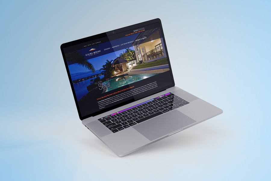
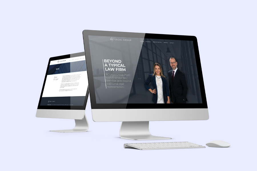
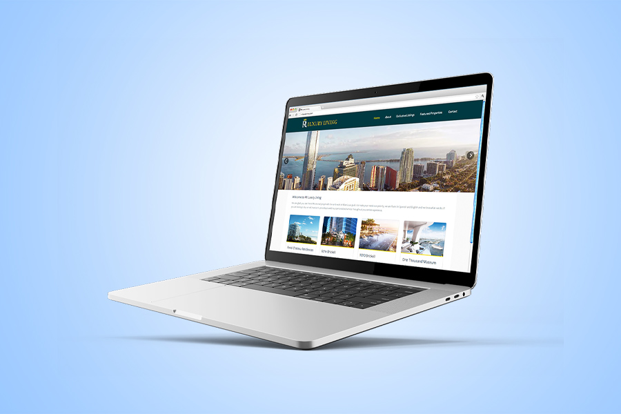
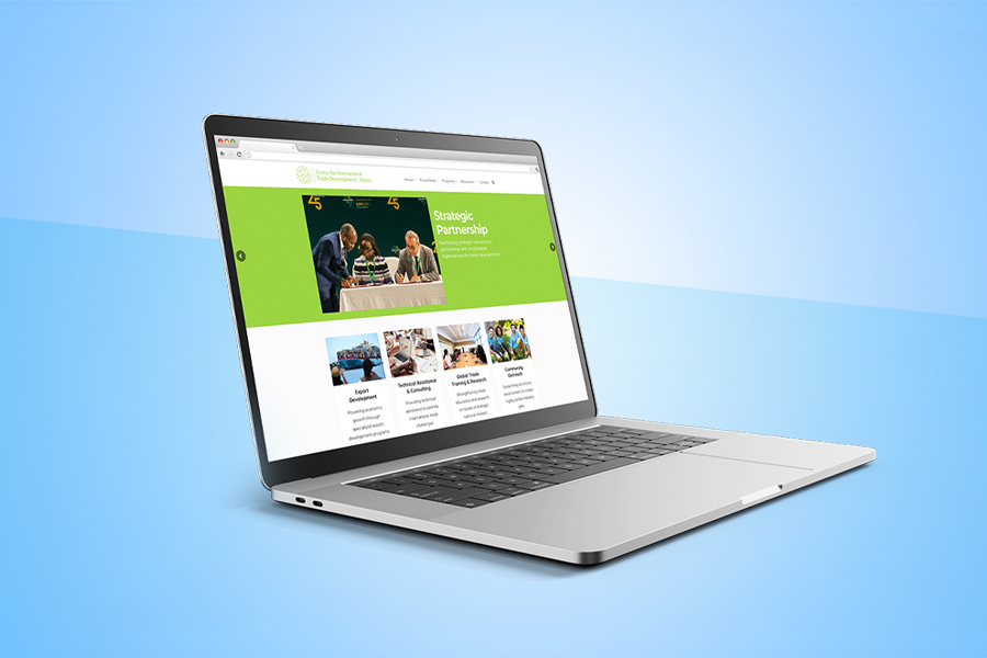
WordPress Responsive Websites
Custom-built WordPress sites that look great on every device.
Mobile-Friendly Redesign
Update your existing website to meet modern mobile standards.
Performance Optimization
Fast-loading, responsive sites that convert more customers.
Ongoing Support
We help keep your responsive website maintained and up to date.
Explore our Website Design & Digital Marketing solutions.
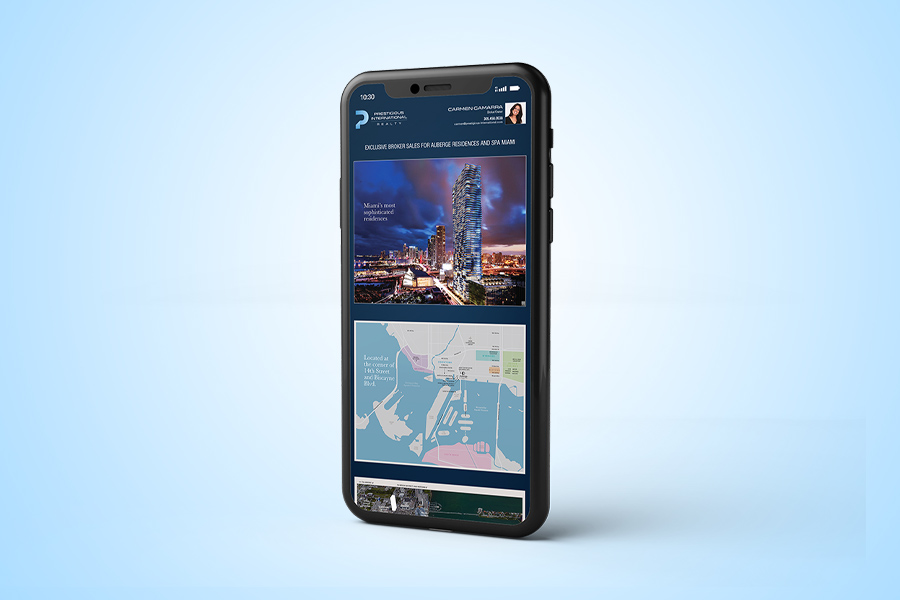
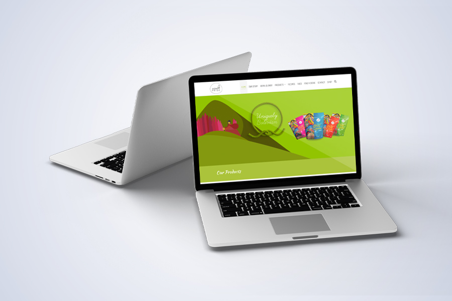
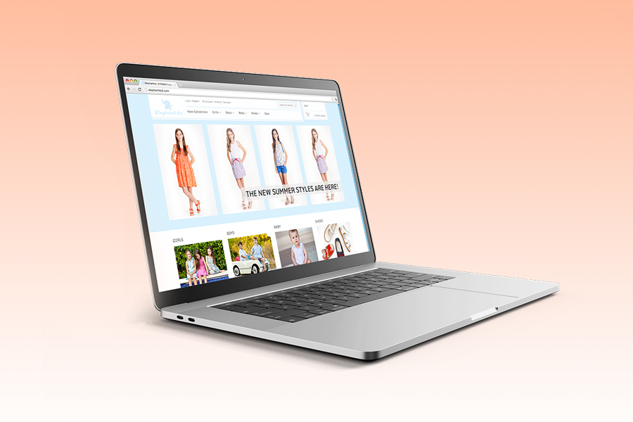
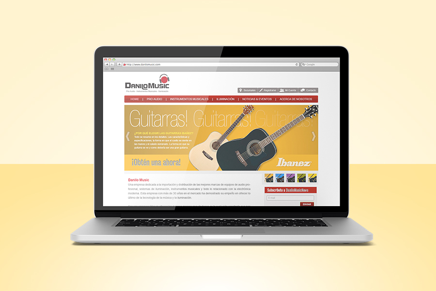
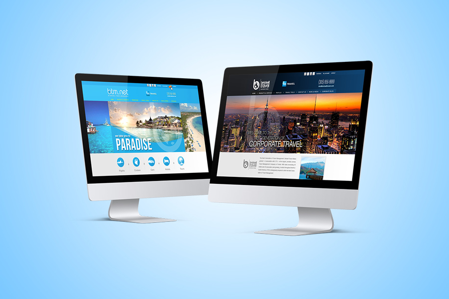
Responsive Web Design Portfolio


Frequently Asked Questions
Why is responsive web design important?
Responsive web design makes sure your site works and looks great on any device, helping you reach more customers and improve SEO.
Can you make my current website responsive?
Yes, we can redesign or adapt your existing site to meet modern responsive standards.
How long does a responsive website project take?
Most responsive design projects are completed in 3–5 weeks, depending on scope.
Some of the names that trust us
Ready to Launch Your Responsive Website?
Work with a Miami web design team to help your business grow online. Fill out the form below or call us directly at 305-373-7029.